- Mark as New
- Bookmark
- Subscribe
- Mute
- Subscribe to RSS Feed
- Highlight
- Report Inappropriate Content
15-03-2026 12:34 AM
'Research pricing yourself with our powerful Product Research Tool.'
Ooh, a powerful Product Research Tool... very impressive sounding. I wonder if it's as good as the AI listing tool? 🤖
Has anyone tried it?!


- Mark as New
- Bookmark
- Subscribe
- Mute
- Subscribe to RSS Feed
- Highlight
- Report Inappropriate Content
16-03-2026 8:42 AM
Why is this continually happenning? Exactly the same reason as why 'Opal Fruits' became 'Starbusts' [ thats a reference for those in the UK of 50+ years age...] ie there was a 'marketing department' paid to come up with ideas to improve sales. No ideas = no need for the department ie no jobs. So of course those already in the jobs carry out extensive research etc to be able to prove to senior management that 'a rebrand to Starbursts will increase sales' . And the marketing people get their salary, and move onto another ''improvement" . These days it is no different. Just the name of the department has changed. What i don't understand is why senior management don't simply see the cost drain of all these un-necessary changes. They didn't 'back in the day' and they still don't.....
- Mark as New
- Bookmark
- Subscribe
- Mute
- Subscribe to RSS Feed
- Highlight
- Report Inappropriate Content
16-03-2026 12:22 PM
'Exactly the same reason as why 'Opal Fruits' became 'Starbursts'
I'm sure those of us that first knew them as Opal Fruits will always think of them as Opal Fruits! I think the name was changed because they were called 'Starburst' when they were introduced in the US, so eventually they decided to 'streamline' the brand so the name would be the same everywhere. I don't know why they didn't stick with Opal Fruits for the US market... 🙄
Many of the changes on eBay appear to be unnecessary/change for the sake of change.
People don't like familiar brands changing names - especially if the names seem worse/unsuitable. In this house, Snickers are still Marathon, and Cif is still Jif... 😄 (and Lloyds Bank, please put the horse's head back to looking in the opposite direction, the way it's supposed to be...!)


- Mark as New
- Bookmark
- Subscribe
- Mute
- Subscribe to RSS Feed
- Highlight
- Report Inappropriate Content
16-03-2026 10:31 PM
OMG that ‘do your homework’ one grates on me. I’ve been here over 20 years to be told ‘do your homework’, I mean, really? If I hadn’t been doing that from day one I wouldn’t be here over 20 years later!
in fact, I have found that the more ebay tinkers and meddles, the more hours I have to put in. Flogging a dead horse comes to mind these days. Just when you think you have got to grips with one set of meddling, they have to do it again then rinse and repeat.
- Mark as New
- Bookmark
- Subscribe
- Mute
- Subscribe to RSS Feed
- Highlight
- Report Inappropriate Content
17-03-2026 11:09 AM
'in fact, I have found that the more ebay tinkers and meddles, the more hours I have to put in.'
Yes - even if you just want a quick glance at completed listings, to get an idea of prices for something you might want to sell, or buy, it takes longer these days because of the poor search function.
And sorting a seller's sold listings by high to low used to show the accepted best offer price, but not any more - although you can sometimes see what price was accepted if the buyer leaves feedback, but more often, the price is just struck through. Anyway, by the time you've done all the extra clicking and scrolling and filtering to get to the feedback, chances are you've forgotten what you were wanting to look at... 😬
I think it's eBay that need to 'do their homework', and correct the problems they have created!


- Mark as New
- Bookmark
- Subscribe
- Mute
- Subscribe to RSS Feed
- Highlight
- Report Inappropriate Content
18-03-2026 11:15 AM
"see what price was accepted if the buyer leaves feedback"
I sell as a legit business on ebay.com and soemtimes the accepeted price doesnt show the accepted offer price of the item it shows the buy it now price it was listed at, also the same for volume discounts, eg 3 items at 10 bucks with 20% volume disocunt would show in feedback as a 30 buck sale.
- Mark as New
- Bookmark
- Subscribe
- Mute
- Subscribe to RSS Feed
- Highlight
- Report Inappropriate Content
22-03-2026 11:26 AM
"Every second that a user is confused, wastes time going round in circles or clicking between multiple screens where there used to be one, is good for ebay. Simplicity, efficiency and being user friendly count for nothing when time wasting, complications and confusion raise ebay's profile in the rankings and the share price is influenced by ebays place in them."
Here's another example, although I'll state upfront that I could be completely wrong, and it could just be my memory playing tricks. I'm sure someone will put me straight. If I get a bit of egg on my face, so be it!
When typing in the description field during listing (on the desktop site, not the mobile site or the app), I'm pretty sure that if you, say, clicked on the 'Bold' or 'Italic' icon, the text cursor would remain in situ in the text field, ready for you to type your bold or italicized text. What happens now is that clicking on one of those icons results in the text entry cursor disappearing, meaning you have to click back in the text field to make it reappear. "Big deal", some might say, but it gains in significance the more times you have to do this in a listing. It is particularly annoying when - as is the norm for me - it is paired with the lag on eBay, as the delay often means that I think a change (e.g. 'Bold' on, 'Italics' off) hasn't registered when actually it has (but I've already clicked on the icon a second time, thinking it had had no effect, so I've just reversed my own action, and have to click on the icon again!
Like I say, however, maybe I'm wrong, and it was always like this; it could just be that the lag I now experience has made me more aware of the need to click back in the text field before I can continue entering text in it.
A couple of other slight niggles (minnows, really, considering the more major issues with the platform):
1 - Sort of related to this thread: redundancy regarding access to one's Watchlist. From my landing page (and other pages) I can click on 'Watchlist', which is followed by a down arrow, indicating that clicking on it will bring up some kind of drop-down menu (that's what I normally associate the down arrow with). Clicking on it results in a large pop-up window showing a selection of items on my Watchlist and a clickable link to "View all items you're watching". Why doesn't clicking on 'Watchlist' just, you know, bring up all of your Watchlist right away (rhetorical question)? It does say 'Watchlist', after all, not 'Watchlist selection'. So there's another example of eBay making you take an additional step to get to a page that you should have been able to navigate to in one step.
But I can also click on 'My eBay' (which is also followed by a down arrow, only this one does actually yield a drop-down menu when you click on it) and select 'Watch list' (note that, even on the same page, eBay is not consistent - is it 'Watchlist' or Watch list'? Pretty trivial, I know, but when you're already wound up...). Clicking on that does take me straight to my full Watchlist.
Why the two different methods of accessing the Watchlist in such close proximity on the same page? And why does one method only initially show you a selection (determined by what?) of what's on it? Why would anybody wish to view a selected-by eBay sample of what is in their Watchlist rather than the whole list?
2 - Not really connected with this thread (sorry), but another minor issue that bugs me, and it's probably something that only affects my account (and maybe a few others), as I've never seen it posted.
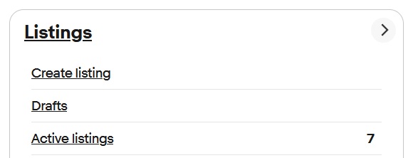
In Seller Hub, to the right of 'Drafts' there is no figure at all. I do actually have an item in Drafts, so it should say '1'. Even when I have nothing in there it should say '0', but as you can see from the screenshot, it's just blank. It's been like this for ages, and it's one of those things that barely seems trying to raise with eBay (I imagine, on the basis of past interactions, that trying to get CS to even understand the issue, let alone remedy it, would result in more frustration than is caused purely by the problem itself). I generally know if I have something in Drafts, and even if I don't, I only need to click on the link to see, so I just put up with it.
Anyway, this is an excellent thread, with some great contributions. It had never really occurred to me that eBay (and other sites) benefit just from the amount of time a person stays active (clicking, scrolling, typing, etc.) on their website, even if a purchase is not made or a potentially fee-earning listing is not created, so reading the posts here has been an eye-opener.
Can someone let me know if my memory has let me down regarding the 'clicking in and out of the description text field' bit?!
- Mark as New
- Bookmark
- Subscribe
- Mute
- Subscribe to RSS Feed
- Highlight
- Report Inappropriate Content
22-03-2026 5:01 PM
'Clicking on it results in a large pop-up window showing a selection of items on my Watchlist and a clickable link to "View all items you're watching". Why doesn't clicking on 'Watchlist' just, you know, bring up all of your Watchlist right away (rhetorical question)? It does say 'Watchlist', after all, not 'Watchlist selection'. So there's another example of eBay making you take an additional step to get to a page that you should have been able to navigate to in one step.'
It's the same if you click on the feedback score next to a seller's name, at the top of the item page. Up comes a pop-up box, with a pointless, random selection of feedback, forcing you to scroll down to the end of the box to reach the 'see all feedback' button - click on that, and it takes you to the 'mobile-friendly' feedback page, with the fiddly filtering system, involving more pop-up/sliding boxes... 🙄
So, it's another click to 'switch back to classic view' - and finally you can start looking for what you expected to be able to see in one click.
I can't see the benefit to eBay from all this extra clicking & fiddling around. Being detained on the website by this sort of time-wasting activity is making me feel less inclined to buy, or sell.
'Can someone let me know if my memory has let me down regarding the 'clicking in and out of the description text field' bit?!'
If I want to bold or italic some text, I always write the text first, highlight it, then click the bold or italic icon. I never click the icon first - although that is probably the more logical way... 🤔
Hopefully someone will be able to clear up the 'clicking in & out' thing for you!

- Mark as New
- Bookmark
- Subscribe
- Mute
- Subscribe to RSS Feed
- Highlight
- Report Inappropriate Content
22-03-2026 8:33 PM
The powerful product research tool is just a search that goes back up to 3 years ( it used to be called something else that I can't remember). Unfortunately you can't click through to sold listings that are older than 90 days to get a better view of them.
It does show the selling price of sold items that were sold via an offer though ( the ones that are normally shown with a line through the price )


- Mark as New
- Bookmark
- Subscribe
- Mute
- Subscribe to RSS Feed
- Highlight
- Report Inappropriate Content
22-03-2026 8:41 PM
Used to be called terapeak when it was a third party service that ebay purchased.
- Mark as New
- Bookmark
- Subscribe
- Mute
- Subscribe to RSS Feed
- Highlight
- Report Inappropriate Content
22-03-2026 11:31 PM
I can’t really remember about the description field thing (simply because my memory has been poor since my emergency surgery and trip on life support) but the lag these days is annoying the hell out of me. I feel like Im always waiting for ebay to finish loading. Part of the reason why I don’t list as much as I could is because I lose my temper waiting for the lag to finish. I struggle enough as it is these days and can’t sit staring at a screen for long periods so having to deal with lag as well is incredibly frustrating. I just can’t get things to adapt to my needs nowadays, everything is so ridged and clicky clicky all the time.
- Mark as New
- Bookmark
- Subscribe
- Mute
- Subscribe to RSS Feed
- Highlight
- Report Inappropriate Content
24-03-2026 1:04 PM
'I see they've changed it back to "Unsold"!'
Today's pop-up box says:- 'Introducing "Inactive" listings. This page now includes all previously active listings that are no longer visible to buyers. It replaces "Ended" and "Unsold" statuses.'
So, 'Inactive' is back - and looks like it is here to stay this time..!
- Mark as New
- Bookmark
- Subscribe
- Mute
- Subscribe to RSS Feed
- Highlight
- Report Inappropriate Content
24-03-2026 9:48 PM
Obviously they didn’t get the memo on how stupid that is. Everyone wants a ‘one size fits all’ box these days. There’s a thing called ‘thinking outside the box’ and it can be very good.

- Mark as New
- Bookmark
- Subscribe
- Mute
- Subscribe to RSS Feed
- Highlight
- Report Inappropriate Content
24-03-2026 10:11 PM
I have to ask, was there any point to having separate "Ended" and "Unsold" ? I probably missed "Ended", when I last sold anything I'm pretty sure live listings that I ended went onto my Unsold page and "Ended" didn't exist.
Perhaps ebay is becoming embarrassed by how few items sell now and that "Unsold" reminds sellers of the fact and how much effort they put in for so little in return.
- Mark as New
- Bookmark
- Subscribe
- Mute
- Subscribe to RSS Feed
- Highlight
- Report Inappropriate Content
25-03-2026 11:22 AM
I think you may be right, its dwindling and there trying to cover it up.
- Mark as New
- Bookmark
- Subscribe
- Mute
- Subscribe to RSS Feed
- Highlight
- Report Inappropriate Content
25-03-2026 1:16 PM
'Perhaps ebay is becoming embarrassed by how few items sell now and that "Unsold" reminds sellers of the fact and how much effort they put in for so little in return.'
😄
Yes - maybe they thought 'Inactive' would be the best euphemism for 'Unsold'... and that it would be more 'streamlined' to have one place for unsold/ended items, rather than two.
'Ended' seems to have been gradually phased out - I can't remember when it vanished from the 'basic' selling page, but a friend said their Seller hub still had Unsold and Ended, up until this announcement.
I used to think of 'Ended' as the items I had chosen to end, for whatever reason - and 'Unsold' as unsold auction items. The merger will more annoying for those who found it helpful have those separate sections.
I still think 'Sold' & 'Unsold' makes more sense than 'Orders' & 'Inactive'.
- Mark as New
- Bookmark
- Subscribe
- Mute
- Subscribe to RSS Feed
- Highlight
- Report Inappropriate Content
25-03-2026 1:37 PM
To me ' Orders' always was a misnomer. An order is nothing until the payment is received. THEN it becomes a Sale.
Perhaps again ebay was trying to get away from 'Sold', given that it would seem from the boards that many never have a happy outcome because of NPBs, return requests or INR refunds, so Sold looked too conclusive.
Whatever, I agree Sold and Unsold makes more sense and is clearer than anything else that ebay has tried to replace them with.